Book Cover Design That Sells: What Makes a Cover Work in Your Genre
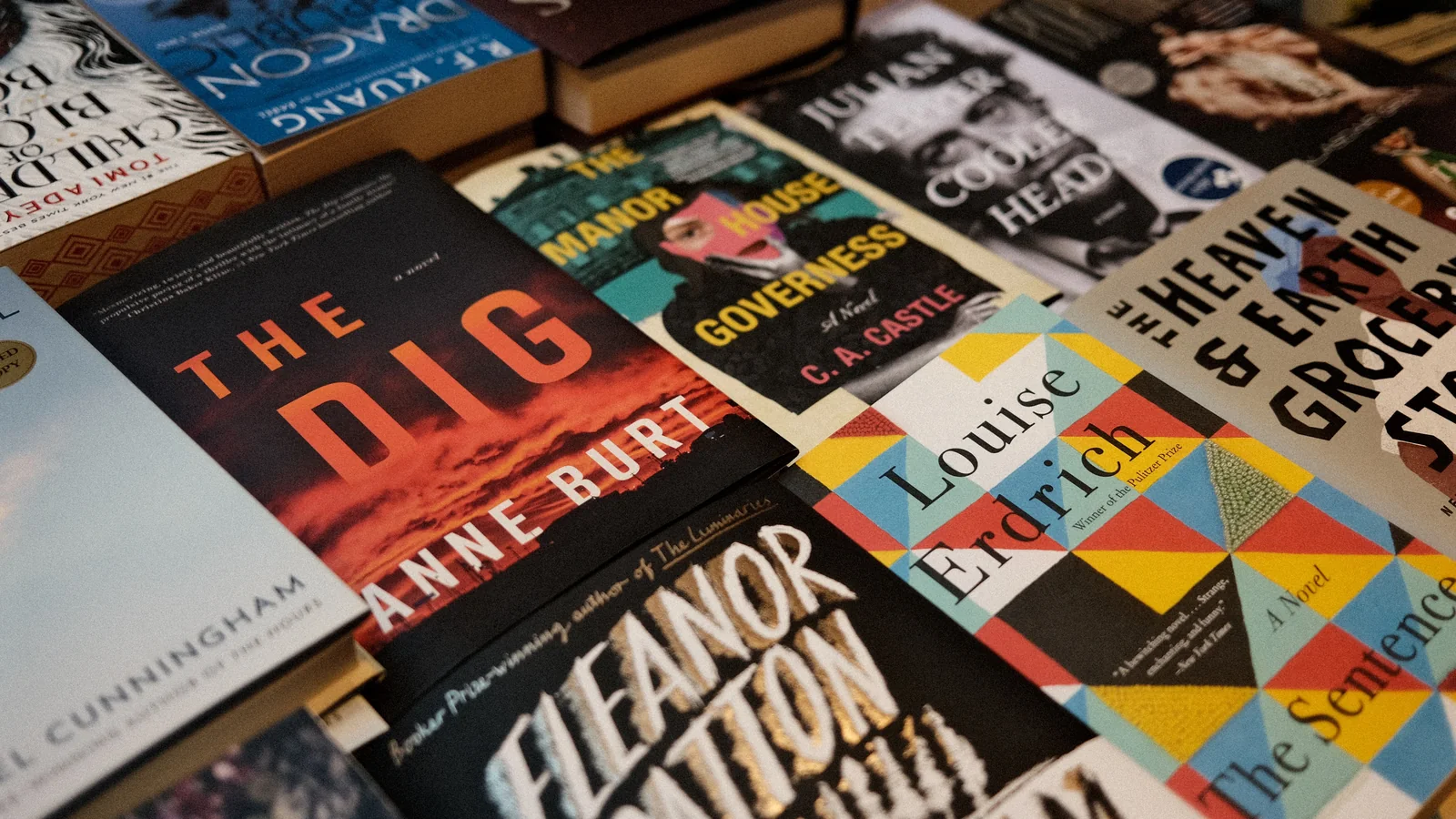
A book cover sells when it does three things: reads instantly as a thumbnail, signals its genre in under two seconds, and commits to one strong focal point. Readers judge covers at 100–200 pixels wide on a phone, so if the title isn't legible that small, the sale is already lost. Match your genre's visual conventions first — readers are trained to recognize romance, thriller, fantasy and non-fiction by their look — then differentiate within those rules through color and imagery. Build ebook covers at 1600×2560px (1.6:1 ratio), use two fonts maximum, and remember a print cover is three surfaces: front, spine and back. Here's how to make each decision.
Your cover is the single most important marketing asset your book has — studies put its impact on browse-to-click conversion at 30–50%. Readers make a snap judgment in under two seconds, and a cover that looks dated or off-genre gets filed as “amateur” before a word is read. Here's what actually makes a cover sell in 2026.
The thumbnail is the real venue
On Amazon your cover first appears as a tiny thumbnail in a scrolling carousel, often 100–200 pixels wide on a phone. That's where the buying decision starts, so the cover has to work there before anywhere else:
- Title legible at thumbnail size — if you can't read it at 100px wide, it's too small or too fine.
- One dominant focal point — a single strong image or type treatment, not a cluttered collage.
- High contrast so the design holds up shrunk down and on varied screens.
- Breathing room around each element — crowded covers turn to mud at small sizes.
Design for the thumbnail first and the full-size cover second, not the other way around.
Fit your genre first, stand out second
Readers have been trained by thousands of covers to associate certain looks with certain genres. Break those conventions and readers won't recognize your book's category; nail them and your cover becomes a magnet. The order matters: match genre conventions so buyers instantly recognize the category, then differentiate with color and imagery within those rules.
| Genre | Visual conventions readers expect |
|---|---|
| Romance | Warmth, emotion, connection; increasingly illustrated couples rather than photos |
| Thriller / suspense | Dark backgrounds, bold high-contrast type, tension |
| Fantasy | Ornate custom lettering, rich layered textures, atmosphere |
| Self-help / business | Clean layouts, white space, bold color, large authoritative type |
| Cozy mystery | Bright, illustrated, charming; light-hearted tone |
| Literary fiction | Restrained, typographic or single striking image |
One 2026 shift worth noting: across romance and YA especially, illustrated covers have largely replaced photographic ones — a photo cover in romance can now read as dated or self-published. Check what the current top sellers in your category actually look like before you commit.
The specs that matter
- Ebook cover: build at a minimum of 1600×2560 pixels, a 1.6:1 height-to-width ratio, saved as JPEG.
- Resolution: 300 DPI for print files; digital displays fine at 72–96 DPI but building large keeps you safe.
- Fonts: two maximum — one for the title, one for supporting text. More reads as amateur.
- Stock images: only with a commercial license covering print and digital; avoid “editorial use only.”
Print covers are three surfaces, not one
For a print book, the front cover is only a third of the job. The full wrap includes:
- Front — does the thumbnail and shelf work.
- Spine — the first thing seen on a shelf; keep type and palette consistent with the front. (KDP prints spine text only on books over 79 pages.)
- Back — a compelling 150–200 word blurb, author bio, and space for the ISBN barcode; keep the palette and typography consistent with the front so it doesn't undercut trust.
When your cover is the problem
If a book has strong reviews but weak sales, the cover is the usual suspect — and a redesign is the cheapest relaunch you can run. Click-through rates frequently jump after a cover that was off-genre is fixed. If your budget allows, run two versions as low-cost ads and let real click data pick the winner instead of your gut.