How to Choose the Right Font for Your Book Interior
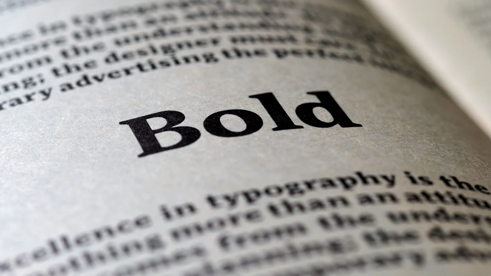
For a book interior, use a readable serif font for body text — classics like Garamond, Caslon, Baskerville, Minion or Sabon are the standard, because serifs guide the eye across long passages of print. Set the body at roughly 10 to 12 point (11pt is the common sweet spot), with line spacing (leading) at about 120 to 145% of the font size. Use one body font throughout, pair it with a complementary font for chapter titles, and keep it simple. Sans-serif fonts suit headings, children's books and some non-fiction, but serif body text is what makes a novel look like a real book. Here's how to choose.
Font choice is quiet but powerful. A great story set in the wrong font — too big, too tight, a decorative face nobody can read for 300 pages — reads as amateur before the first sentence lands. Here's how to pick a font that disappears into a comfortable reading experience, which is exactly what good book typography should do.
Why serif fonts are standard for body text
Open almost any printed novel and the body text is a serif font — the ones with small feet on the letters (Garamond, Times, Caslon). Serifs are the convention for long-form print because the small strokes help guide the eye along a line of text, and readers associate them with “real books.” Sans-serif fonts (no feet, like Helvetica or Arial) are cleaner on screens and good for headings, but a whole novel set in sans-serif looks and feels off for most genres.
The best body fonts for a book interior
- Garamond / EB Garamond — the gold standard for book body text; elegant and space-efficient (may need a slightly larger point size).
- Caslon / Adobe Caslon — warm, classic, endlessly readable.
- Baskerville / Libre Baskerville — a touch more authoritative; great for non-fiction.
- Minion / Sabon / Palatino — workhorse book faces used across professional publishing.
- Crimson, Lora, Alegreya, Source Serif — solid free alternatives (available via Google Fonts) with proper book-weight designs.
Any of these will look professional. Avoid decorative, script or novelty fonts for body text — they're exhausting to read at length and instantly cheapen a book.
What point size should body text be?
Body text usually sits between 10 and 12 point, with 11pt a common sweet spot — but the right number depends on the font's x-height (how tall its lowercase letters are):
| Book type | Typical body size |
|---|---|
| Novels / adult fiction | 10.5–12pt |
| Non-fiction | 10–11.5pt |
| Large print | 14–16pt+ |
| Children's early readers | 14–18pt |
Fonts with a small x-height (like Garamond) often need 11.5–12pt to read comfortably; fonts with a large x-height can work at 10.5–11pt. Print a test page and read it at arm's length before committing.
Line spacing (leading) matters as much as the font
Leading is the vertical space between lines. Too tight and the text feels cramped; too loose and it feels disconnected. The standard is 120–145% of the font size — so 11pt text typically gets around 13–16pt of leading. Denser non-fiction can run tighter; literary fiction and poetry benefit from a little more air.
A few rules that keep it professional
- One body font throughout. Don't mix body fonts between chapters.
- Pair, don't clash. Use one complementary font for chapter titles/headings — a sans-serif or a display serif — and stop there. Two fonts is plenty.
- Justify with care. Justified text (straight edges both sides) is standard for print fiction, but enable hyphenation so you don't get rivers of white space.
- Check the license. Make sure any font you embed is licensed for commercial/embedding use — Google Fonts and properly purchased fonts are safe.
- Ebooks are different. In a reflowable ebook the reader picks the font, so your job is clean structure, not a locked typeface.