How to Design a Company Profile or Brochure
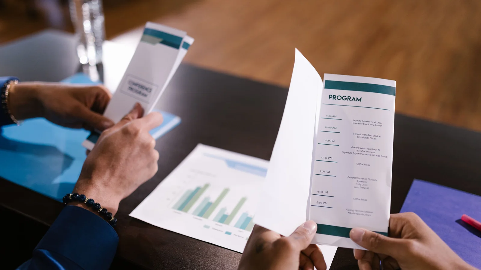
A company profile is a designed document that introduces your organisation — who you are, what you do, and why you're credible — to clients, partners or investors. A strong one leads with a clear cover and overview, then covers your story/mission, services or products, key strengths and differentiators, team or leadership, notable work or capabilities, and contact details. Design carries the credibility: a consistent brand system (logo, colours, typography), strong imagery, a clean grid, and clear hierarchy make it look as professional as the organisation it represents. Here's how to structure and design one.
A company profile (or corporate brochure) is often the first substantial impression an organisation makes on a prospective client, partner or investor. It's your business distilled into one document — and its design signals your professionalism before anyone reads a word. Here's how to build one that impresses.
What a company profile is for
A company profile introduces and establishes credibility for your organisation. It's used in pitches, tenders, partnership conversations, investor meetings and on your website as a downloadable PDF. Unlike a quick flyer, it's a considered document that tells your story and makes the case for working with you — so both content and design need to feel substantial and trustworthy.
The sections to include
- Cover — company name, logo, a strong image or design, and a tagline.
- Overview / introduction — who you are in a few lines; the elevator pitch.
- Story / mission & vision — your purpose, values and what drives you.
- What you do — services or products, clearly laid out.
- Why you — differentiators, strengths, approach, expertise.
- Capabilities / work — notable projects, sectors served, or case highlights.
- Team / leadership — the people, especially for service businesses.
- Clients / partners — logos or sectors, if appropriate.
- Contact — a clear call to action and how to reach you.
Not every profile needs every section — tailor it to your business and audience — but this is the standard toolkit.
Structure it as a story
A good profile isn't a list of facts — it flows: who we are → what we believe → what we do → why we're the right choice —> how to work with us. Lead with the strongest, most relevant material (busy readers skim), and design each section to be scannable so someone flipping through still absorbs the key messages.
Design carries the credibility
- A consistent brand system — logo, colour palette, typography and iconography applied throughout. Inconsistency reads as unprofessional.
- Strong imagery — real photography (your team, work, premises) beats generic stock; quality images signal quality organisation.
- A clean grid and white space — crowded pages look cheap; breathing room looks premium.
- Clear hierarchy — headings, subheadings, pull quotes and callouts that guide the eye.
- Data as visuals — stats, timelines and processes as infographics, not paragraphs.
Print and digital versions
Most company profiles live as a PDF (emailed, downloaded, presented on screen), and some are printed for meetings and events. Design for both: a clean layout that reads well on screen with a hyperlinked contents page for longer profiles, and print-ready specs (correct bleed, 300 DPI images, CMYK) if you'll print it. Keep the file size reasonable for email and web.